Exclusively representing
Jacob Stead
The UK-based illustrator Jacob Stead works in a bold and imaginative style which is clear, direct and inviting – ideal for editorial, publishing and advertising projects. His strong figures, colourful settings and a little hint of folk-art influences combine for perfect visual storytelling.
What clients like most about Jacob is that they know what to expect – his style and professional manner are always consistent, while his ideas are refreshing and inventive. You can tell from his work that he enjoys expressing himself through concepts and pictures, having honed his raw talent studying at both Leeds College of Art and Design and then UWE Bristol for his BA in Illustration.
In music and art, Jacob admires sincerity and energy, which is why he’s so inspired by folklore, folk art, folk music and even folk horror movies. He’s fascinated by the strange and supernatural stories and landscape of Britain.
Styles
Jacob has streamlined his working process using Photoshop to create digital illustrations. He often uses a reduced palette of three gradient colours, which he spends time honing to ensure natural blends and just the right atmosphere.Style
Contemporary, bold and instantly recognisable, Jacob’s work uses strong forms, contrast, colour and hints of texture to catch the eye. Light-hearted and often with a touch of humour, he appeals to the imagination.Client list
Some of Jacob’s clients include The New York Times, The Guardian, The Wall Street Journal, The Washington Post, Variety, Fortune and Scientific American.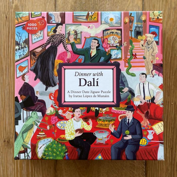
Dinner with Dali
Be puzzled by Dali and his companions in a new jigsaw illustrated by Iratxe López de Munáin.

Everyone Can Run
With a positive goal for the beginning of a new year, Iratxe López de Munáin illustrates for Glorious Sport Magazine.
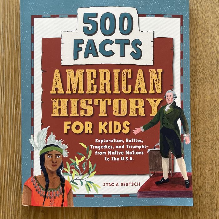
American History
A fabulous children's book celebrating American history is packed with illustrations by Iratxe López de Munáin.
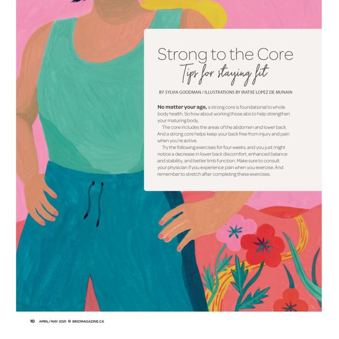
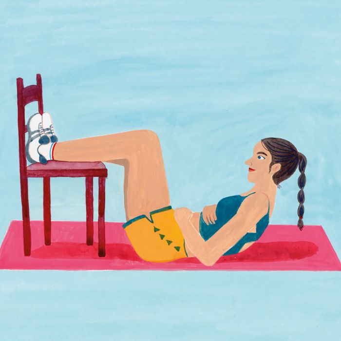
Strong to the Core
Iratxe López de Munáin illustrates Brio Magazine's 'Tips to Stay Fit' in her charming and warm style.
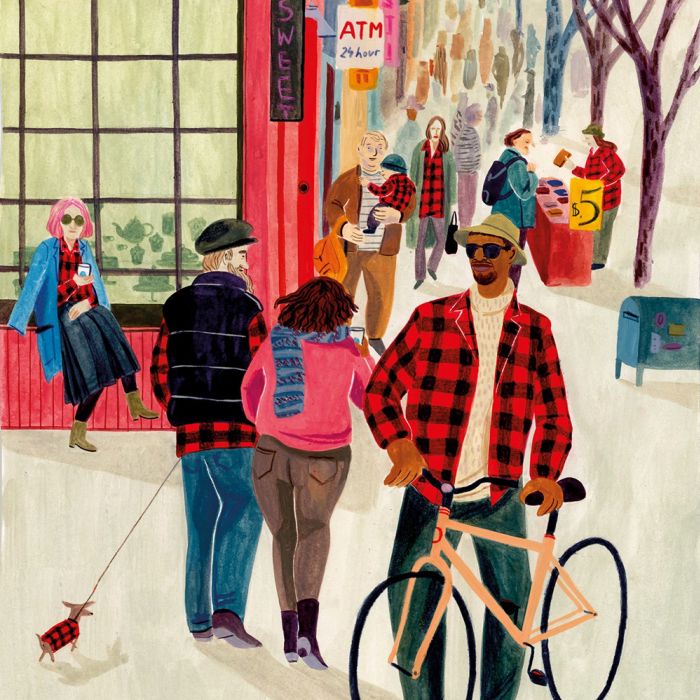
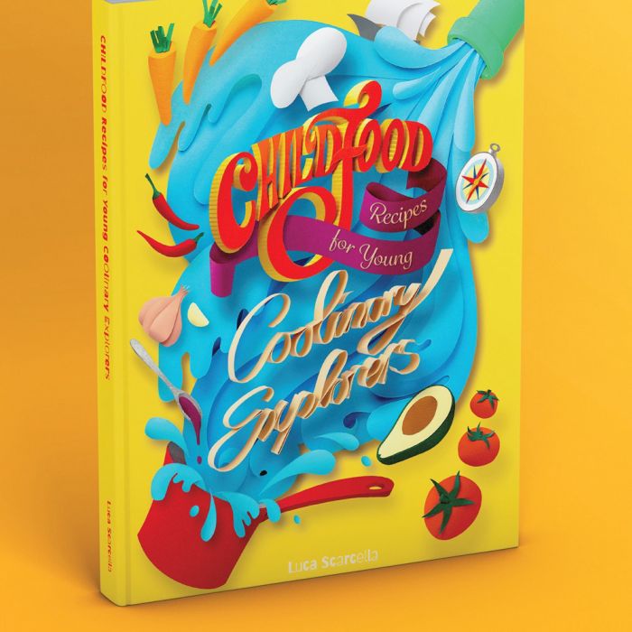
Childfood - Recipes for Young Coolinary Explorers
Gail Armstrong, Ayang Cempaka, Nikolai Senin and Iratxe López de Munáin feature in this stunning culinary book for children.
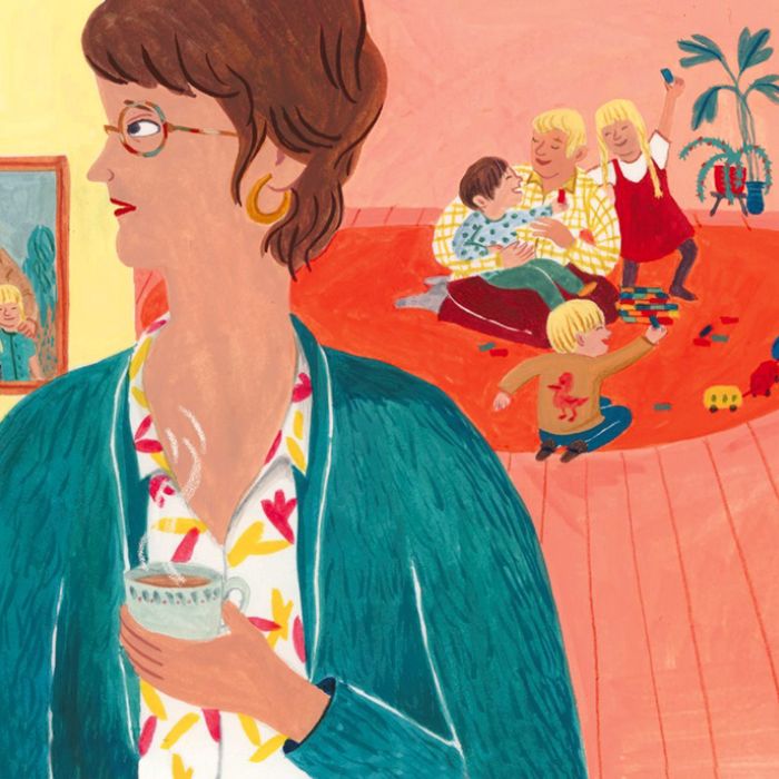
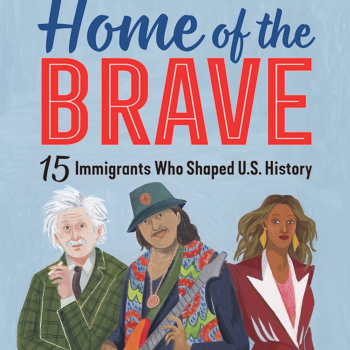
American History
Iratxe López de Munáin works on a new book published by Callisto about the immigrants who have helped shape the US.
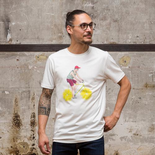
T-shirt Collaboration
Spring has arrived in the form of these bright, sunny t-shirts designed by Iratxe López de Munáin in partnership with Olow
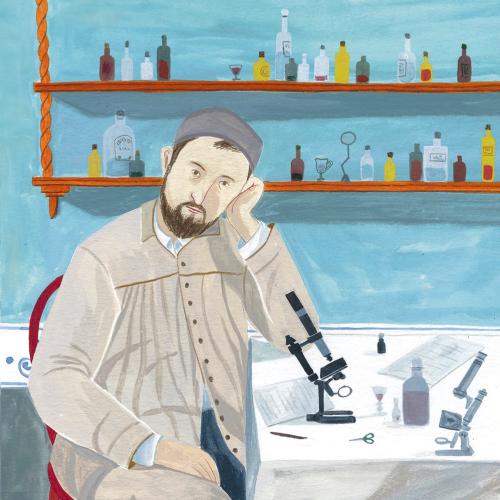
Heroes of the Microscope
Spanish publishing house Next Door commission Iratxe López de Munáin for portraits of historical heroes.
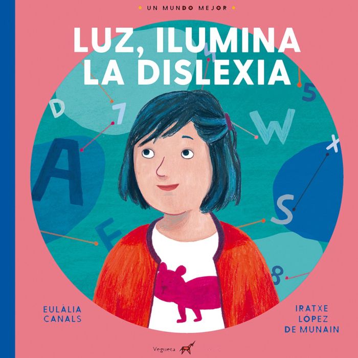
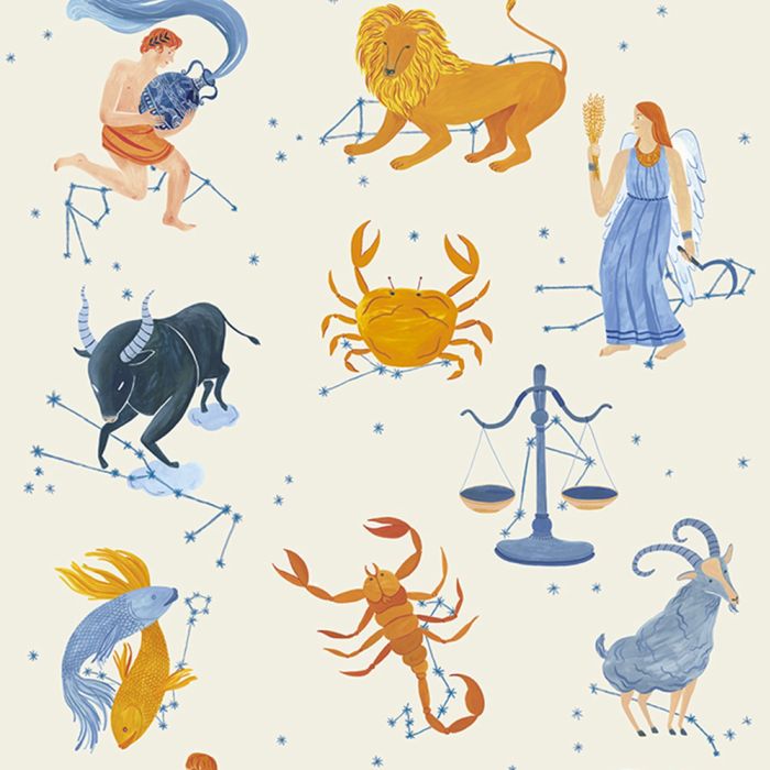
Planetarium Poster
Iratxe López de Munáin illustrates the signs of the Zodiac for a Shanghai Planetarium poster.

Hong Kong Map
Iratxe López de Munain creates an illustrated map of Hong Kong for Cruise International UK.
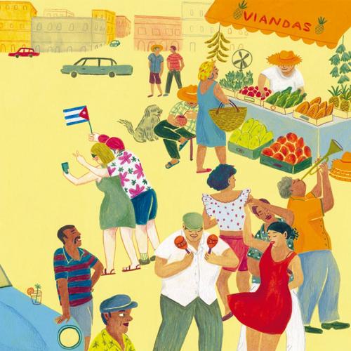
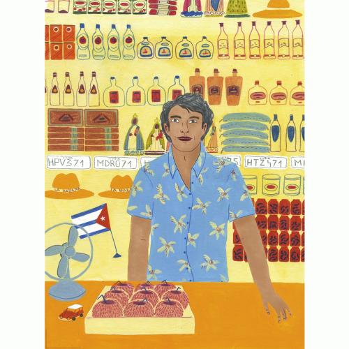
The Changing Face of Tourism in Cuba
Iratxe López de Munain creates a series of illustrations for Citrus Magazine
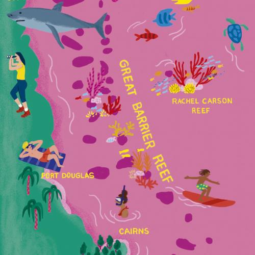
Maps of Adventure
Iratxe López de Munain delights us with the things we can do in Australia and the Aegean Islands.
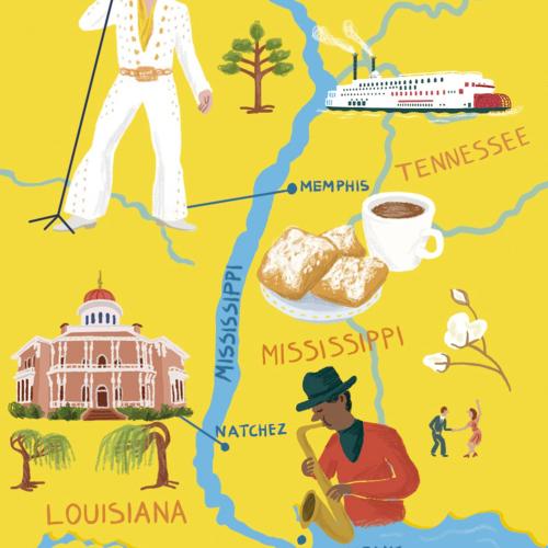
Tulips & Music
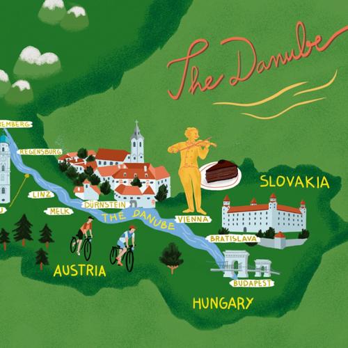
Cruise International commission Iratxe López de Munáin for some jazzy map illustrations.


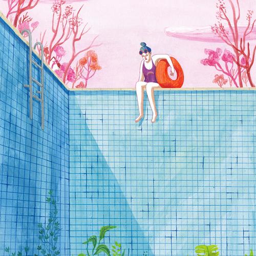
Patient Focus
Iratxe López de Munáin is commissioned by BBH Partners LLP for a medical scene artwork.
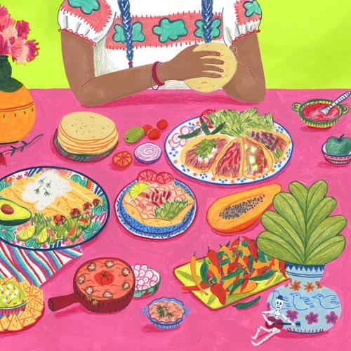
Mexican Food Lovers
Iratxe Lopez De Munain delights your taste buds with the vibrant and tasty illustration.
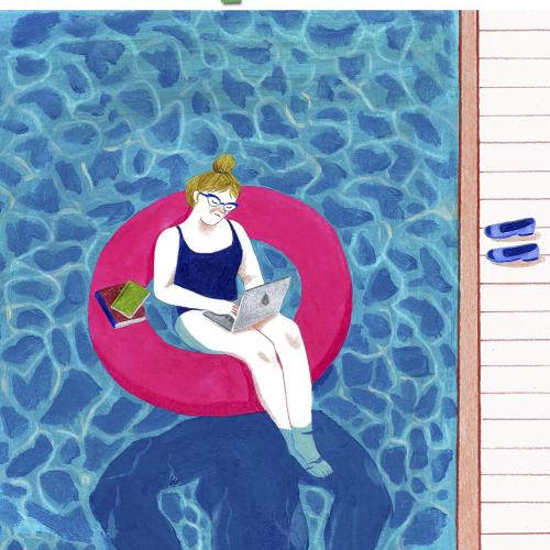
Iratxe López de Munáin's SCRAPBOOK
We ask the Spanish illustrator Iratxe López de Munáin about her training, career and inspirations.
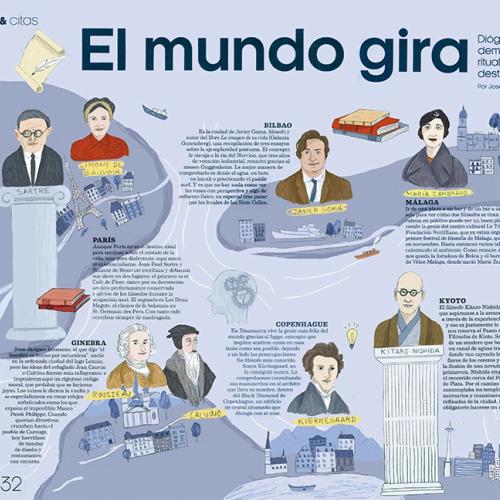
Philosophy
Fashion and Arts Magazine in Spain commission Iratxe López de Munáin for a philosophical map illustration.
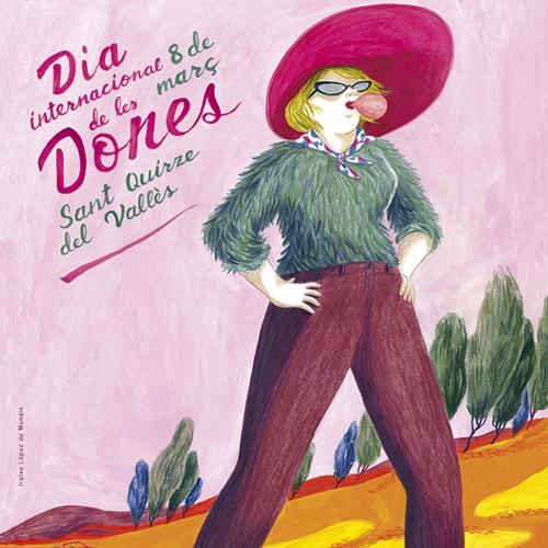
Walking Tall
Iratxe López de Munáin draws a fabulous poster illustration for the town of Sant Quirze del Vallès in Spain.
Browse by style / Categories / Media
3D / CGI RenderingAdvertisingAnimalsAnimationAnimeArchitectureBeautyBlack & WhiteBook CoversCartoon & HumourCharacter DesignChildrenCollage & MontageComicConceptualContemporaryDecorativeEditorialEducationalFantasyFashionFashion LuxeFood & DrinkGamingGIFsGraphicHistoricalIconInfographicInsta Influencers 10K +JewelleryLetteringLifestyleLineLive Event DrawingLooseMapsMedicalNatureNew TalentPackagingPaintingPaper ArtPastichePeoplePhotorealisticPlaces & LocationsPopPortraitsRetouchingRetroSatiricalSport & FitnessStoryboardStreet Art & MuralTechnicalTransportVectorWatercolourWood Engraving & Etching
animation styles / Categories / Media
Hello

