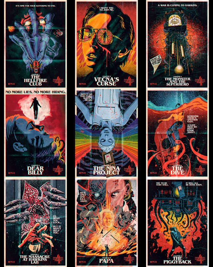
Butcher Billy on his posters for Stranger Things Season 4
Garrick Webster interviews Butcher Billy on his impressive project for Netflix's Stranger Things.
Part 2: Written by Garrick Webster
The Brazilian Pop Art illustrator Butcher Billy has created a series of posters for the Netflix production Stranger Things 4 which have captivated audiences and become a worldwide phenomenon on social media, and beyond.
In the following interview, the artist talks about how the project came about, his creative process and the incredible response to his illustrations.
When and how did the job come about?
I was contacted in February by a New York creative agency called Ralph, which was managing the social media strategy for an upcoming, well-known sci-fi series and wanted to know my availability. They said I would be a perfect fit. When I found out that it was Stranger Things, and that the Duffer Brothers had loved my previous work and had actually suggested my name, I was stoked to say the least.
What was the brief?
They were looking for 80s-style movie posters for each episode of Stranger Things season four – not the usual art that is made for a series, where you see all the main characters grouped together, but something that plays with the iconography, symbols and specific elements of the show, focusing more on the gory and scary scenes, without giving away too much of what happens. Overall, pieces that would work like teasers for each chapter.
What did this opportunity mean to you?
I've worked with Netflix before on promotional material for series such as Queen's Gambit and Cobra Kai, and more notably on Black Mirror where you can actually see some of my work featured in a couple of episodes. But even that wasn't as big or as personal as working on this project.
How did you develop the ideas for each poster?
I was given early screenings of each episode long before it was released. They were actually work-in-progress versions, with unfinished special effects as post-production was still going on when I watched it. I was absolutely free to pick ideas and whatever I thought worked best. I particularly enjoyed choosing the quotes that I thought were the most impactful and memorable in each chapter and making them part of the design.
What kind of look and feel were you going for?
VHS video nasties, 70s and 80s horror movie posters and vintage book covers, most notably Stephen King ones, of course.
What tools and media did you use?
Rough sketches by hand at first, and then digital apps like Illustrator and Photoshop.
What feedback and amends did you receive during the process?
Surprisingly, there was very little feedback. They’d mentioned from the start that they all liked my previous work, so they basically wanted me to do what I usually do, without a lot of interference.
Which poster was most challenging and why?
I decided to design each piece in a way that I didn't have to use a lot of the actors’ likenesses unless it was strictly necessary. I would say that the two that actually feature a main character's face were a bit harder to create as they required more revisions in order to make sure everyone was happy.
Which was your favorite and why?
Probably Dear Billy and The Piggyback because of all the excitement around the particular scenes on which they're based, and the music that was involved.
Your style is heavily influenced by 80s comics, music and movies, and the show is heavily influenced by 80s sci-fi and fantasy. What was the combination like?
It did seem like an ideal combo. I remember when Stranger Things first came out – it absolutely ticked all the boxes for me. Finding out that the Duffers were fans and wanted me to have a go in their playground really felt like things coming full circle.
What has fan feedback on the artwork been like?
To be honest I'm overwhelmed by the attention. People love the pieces and have been sharing them everywhere. I've been getting hundreds of comments, direct messages and even emails with compliments.
Was it just a social media thing?
It was indeed just a social media thing at first, with the pieces being released one at a time to increase the hype for the final chapters. Then with the success of the project, they decided to turn all of the pieces into prints, t-shirts, sweatshirts, hoodies and even billboards.
Where have the posters appeared in the physical world?
As far as I know, they decided to put billboards all over Sunset Boulevard in LA. They asked me to adapt every piece into horizontal versions. It was a last-minute thing, and I have to say I wasn't sure about it at first, as it was a very different canvas from what I worked on originally. However, in the end I think most of them turned out as well as, if not better than, the originals. It was thrilling to see them in physical form, spread all over LA.
Who would you say your main influences are?
Overall, I would say Saul Bass, Jack Kirby, Andy Warhol and Banksy.
PART 1 of this feature can be found here.


