INSIDE OUT: Kwak World X Bob Venables
Garrick Webster reports on Bob Venables' project for the Belgian Beer brand revamp.
Part 1: Written by Garrick Webster
The English pastiche illustrator Bob Venables has painted an array of colourful surrealist imagery to help refresh the popular Belgian beer brand Pauwel Kwak, made by Bosteels Brewery. From new bottle labels to moulded draft tap handles, and from gift boxes to tram exteriors in Brussels, Bob’s imagery has defined the look and feel of a veritable Kwak World.
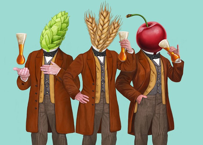
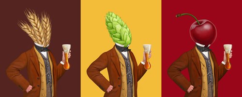
Central to the rebrand, which was led by Epoch Design in Bristol, is Pauwel Kwak, the early 19th century innkeeper central to the narrative. To dust down and refresh the brand, Bob’s imagery replaces Pauwel’s head with a sheaf of grain, a hop cone and a cherry, representing the Amber, Blonde and Rouge varieties of the beer respectively. The artwork brings a playful, quirky and unexpected character to the brand, inspired by the Belgian surrealist Magritte alongside Victorian era ingenuity.
“The first brief involved painting versions of Pauwel for the three bottle labels. He has no face or eyes, so part of the challenge was painting the character’s body in an expressive and eye-catching pose to engage you. The other tricky thing was painting the grain and the hop so that they’re instantly recognisable and make sense to the consumer,” said Bob Venables.
SKETCHING AND PAINTING
Achieving the right look began with multiple sketches as he iteratively refined the character for the three labels. Drawing digitally on a Wacom Cintiq™ tablet in Adobe Photoshop™, he reduced the level of detail and tweaked Kwak’s stance until it looked impactful without sacrificing its sense of fun or its intrigue.
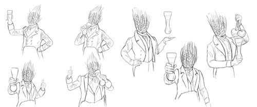
Various approaches were tested. In some test drawings, elements were added cued by the flavour and aroma profiles of each beer. For example, Bob experimented with using cherries and slices of banana as buttons on Kwak’s jacket, but these details were too fine to be noticeable on the shelf. Clothing styles from the 1850s were referenced for Kwak’s trousers, waistcoat and jacket, right down to the cloth textures applied.
When the sketches had been approved, Bob digitally painted the characters for a finish that replicates oil on canvas and reflects René Magritte’s fine, realistic style.
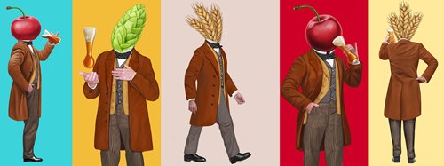
"Once we had perfected the character for the labels, I was briefed again to paint him in full body format and in different poses so that he could be used on the boxes and in various promotional material. All throughout he’s holding the unique Kwak glass, another signifier of the brand that had to be painted with care," said Bob Venables.
KWAK IN MOTION
With the look and feel of the packaging proving successful, Bob was called on once again to create the assets for a 30-second animated television commercial which turned into a surreal world-building adventure. Packing in segments that express the qualities of each of the Amber, Blonde and Cherry flavours, the spot is full of colour and curiosity, setting the brand apart from its traditional, Trappist-inspired competitors.
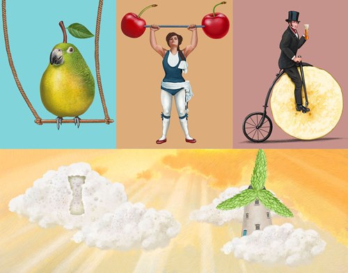
“Although the labels were all-important, painting the elements for the TV ad, along with the backgrounds, was the most exciting part of the project for me. They wanted a parrot made from a pear, Victorian hot air balloons made from caramel and windmills with hops for sweeps. Every day I was sketching and painting something unusual,” said Bob Venables.
Featuring penny farthings with banana slices for wheels, clouds made of beer foam and a strongwoman hefting cherry barbells, these images were passed to the animation team who put them in motion according to storyboard sketches that were also drawn by Bob.
“The clouds were a bit of a challenge. The beer itself produces very fine foam, but if we’d kept it 100 per cent realistic you wouldn’t be able to tell that the clouds were beer bubbles. I kept a few bigger bubbles in there to give them a texture people will recognise. It might even make them thirsty,” said Bob Venables.
TRAMS AND HOT AIR BALLOONS
The Pauwel Kwak rebrand began in Autumn 2021 and has continued apace. Bob’s paintings have stepped out of the packaging and television animations into the three-dimensional world. He has visualised Amber, Blonde and Cherry versions of Pawel Kwak to be moulded into bar tap handles. He has also drawn each character from four angles to be made into life-size inflatables for publicity and promotion.
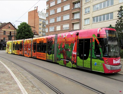
A tram has been traversing Brussels emblazoned from bumper to bumper with scenery from the TV commercial as well as product shots. Activations have spanned France, Belgium and The Netherlands, giving the beer new appeal to drinkers in their 20s and 30s across the region.
“In summer 2023, you might see Pauwel Kwak following in the footsteps of Phileas Fogg. I’ve been helping the client scale up the artwork for use on hot air balloons, which I think is very in-keeping with the ideas and aesthetic of this rebrand. Cheers to that!” said Bob Venables.


