INSIDE OUT: The new look Heston range by Waitrose
How illustrator Bob Venables produced a quintessentially English look for chef Heston Blumenthal’s delectable food range and its packaging.
Written by Garrick Webster
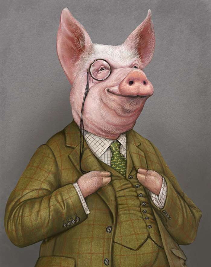
Supermarket packaging styles have chopped and changed in recent years. There has been plain and simple, with typography and brand colours coming to the fore. Other designs have used lots of close-in photography, making the food itself look too succulent to be true. For the repackaging of the Heston range in Waitrose – with 10 new products added to it – the emphasis has shifted towards an eccentric, British look and feel, tying in somewhat with the personality of the celebrity chef behind it, Heston Blumenthal. Animal characters clad in silk and tweed take centre stage.
The packaging for all 62 products has been digitally painted by the illustrator Bob Venables. Over three months, he’s spent his weekends painting pigs with pearl earrings, prawns in suits, pomegranates with Christmas crowns, cows crunching on gherkins… and more.
"Waitrose wanted them to look quirky and English, but not jokey, cutesy or childish, that had to be avoided at all costs," explains Bob. "They had to look adult and up-market, because that’s who these products are for."
Once he’d won the pitch thanks to a sample painting, it was all very quick-fire. He’d receive some briefs on a Wednesday evening, work up the sketches for approval on Friday, and by the time the weekend would roll around he’d be deep into painting to meet a Tuesday deadline. "My record was 10 in a weekend, other times there would be around six, but there was a lot of work in them. You don’t have too long to think about it. I knew where they were going with it and there were very few changes at all," says the artist.
Creating character
A typical brief might say: "We want a cow, it’s for an ice cream product, and it must be wearing a suit and eating marmalade." It was as free as that, and then Bob’s creativity would come into it giving the animal a bit of character, and a certain attitude or expression. With pigs, cows and chickens – animals we generally have an affinity with – that’s more easily done. Posture, the tilt of the head, the poise of the hooves, wings or trotters – Bob used these elements to give the creatures their character.
Sometimes, the focus would be a piece of fruit, like a lemon rowing a boat or an apple having a bath in chocolate. Here, it was the props that helped to give the scene its humour.
"Probably the most logistically difficult was the prawn in a tweed suit. That was the most difficult to draw too, because if you buy prawns in the fishmongers they’ve got their tentacles pulled off. It was knowing where to stop. You’ve got tentacles coming out of the suit, but actually it works quite well. Trying to put an expression on a mackerel’s face, or something like that, is not the easiest," says Bob.
Because of Bob’s experience, and because he asked the right questions early on, the process went very smoothly. The main challenge was painting so many highly detailed artworks in the space of a few months. Amends included small things like changing lemons to oranges, adding seasonal holly leaves, or changing the pomegranate’s Christmas hat to one that looks more like cardboard, because that’s a bit more decadent than a paper one.
The rollout of the new packaging has already started, replacing the existing style, which was done in minimal, chic black with photos of the dishes. The new work looks richer, more fun, and – yes – a bit mad. With Bob’s eccentric artwork on it, you’ll want to buy the Heston range for the paintings just as much as the food inside!


