Crown Inspiration
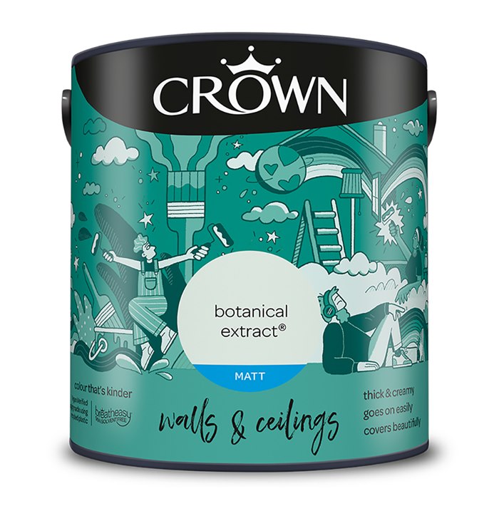
Paperface inspires people to be bold with their paint with packaging art for Crown's most popular range.
Using fun and free line work, Paperface's illustration sets the scene of an interior where painting your room is a pleasure, not a chore.
She explains, "Designing the packaging for Crown’s most popular range was such a fantastic opportunity. The range itself hadn’t been updated for a while so this really was the chance to give it a fresh feel and bring it right up to date for todays DIY-er. For me, the start point was Crown’s brand purpose. I love the idea of inspiring people to paint their world ‘braver, better and beautifuller’ so it was a case of figuring out how to bring those messages to life - I really wanted to bring lots of playfulness and people into the work. The illustration also needed to communicate lots of key messages about the brand and most importantly, connect with people. This formed the basis for the narrative on pack and why the emphasis was on people getting creative and feeling inspired by their interior space."
Watch the ads here.


