exclusively representing
Paperface
Working in a bold, graphical style, Abi Langridge – AKA Paperface – creates illustrations that are punchy and expressive, yet light-hearted in tone and thoroughly charming. Her background in graphic design means she’s adept at reducing clutter and ensuring that the core message hits home in an instant, knows her way around an agency brief and understands the creative process.
Growing up in Grantham, Abi has been drawn to illustration since childhood. She received a degree in graphic design from Leeds University, before working in London and New York, later returning to the UK and settling in Yorkshire. Her time in the US is a big source of inspiration, with the landscape, culture, people, food and wildlife across the country feeding into her personal work.
Approach
Sketching and working digitally, Abi’s approach is informed by her graphic design training. She uses illustration to communicate, never to decorate, and it’s always about stripping away the noise and concentrating on the message and emotion of the piece.Styles
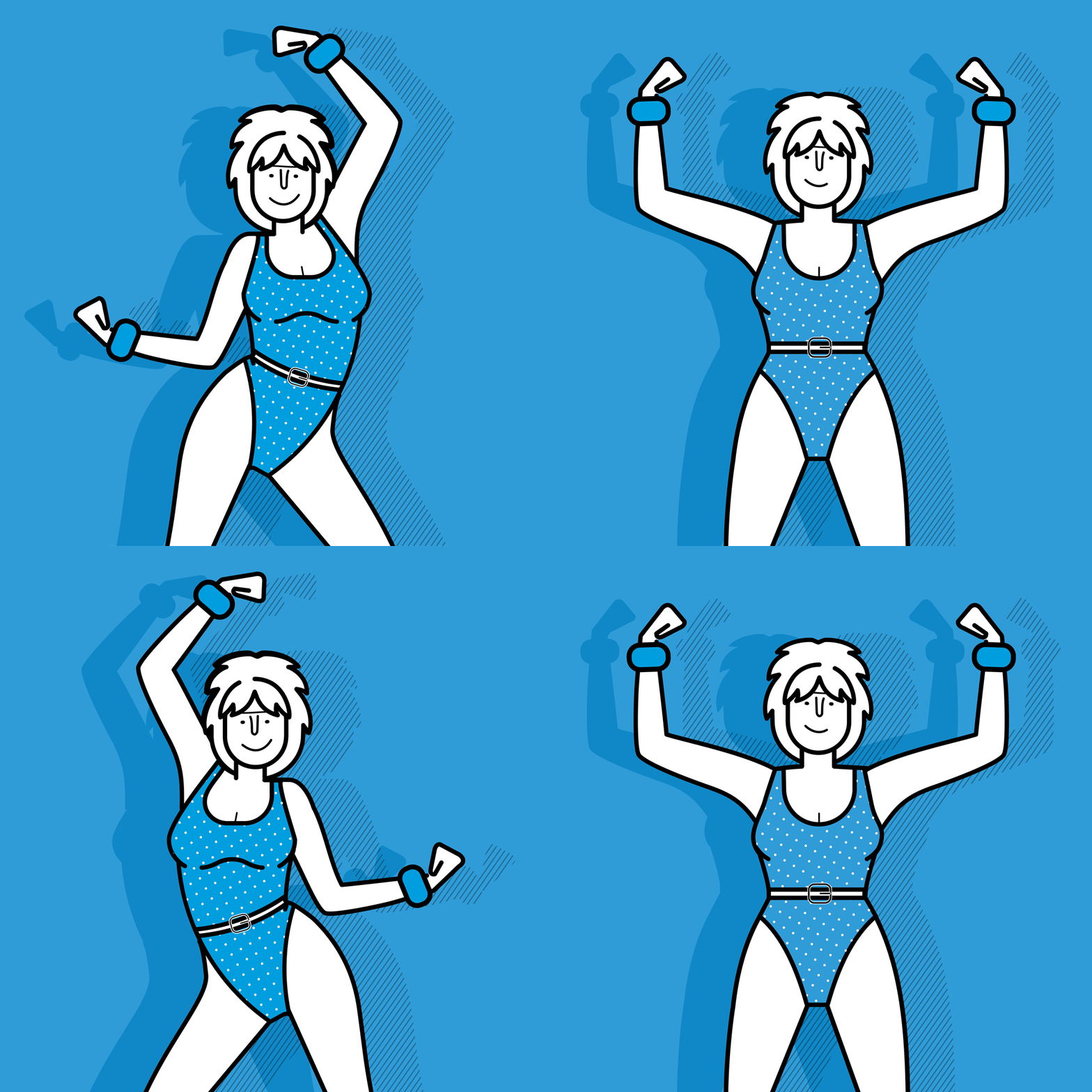
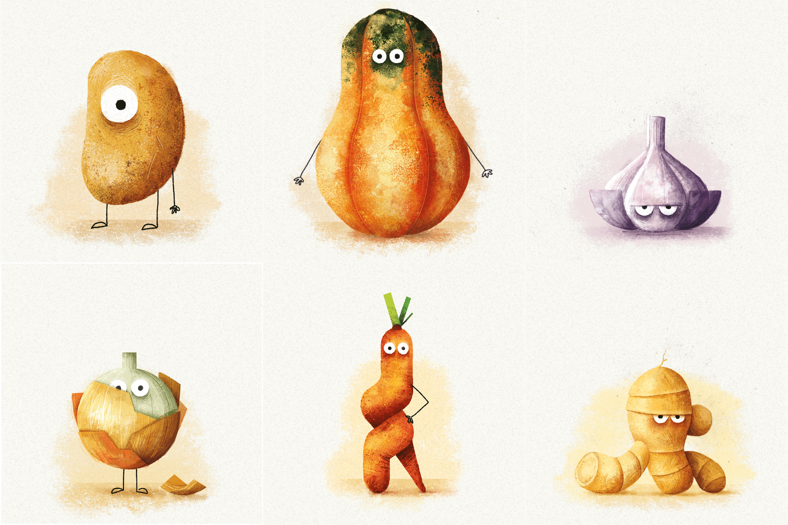
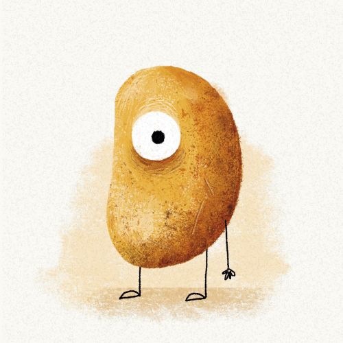
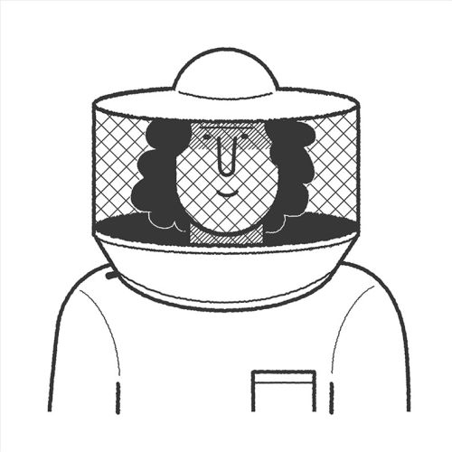
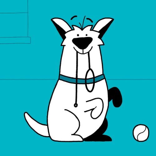
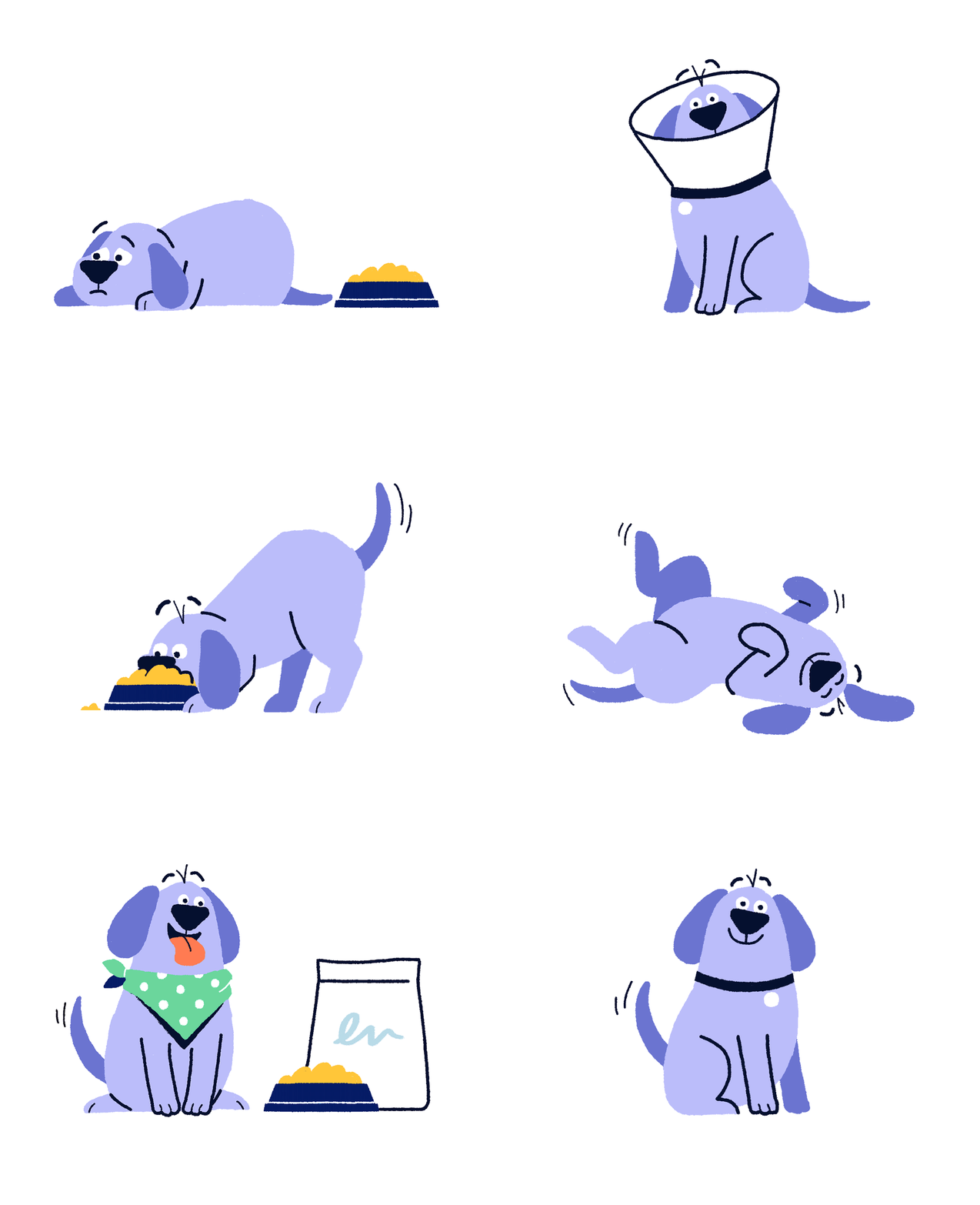
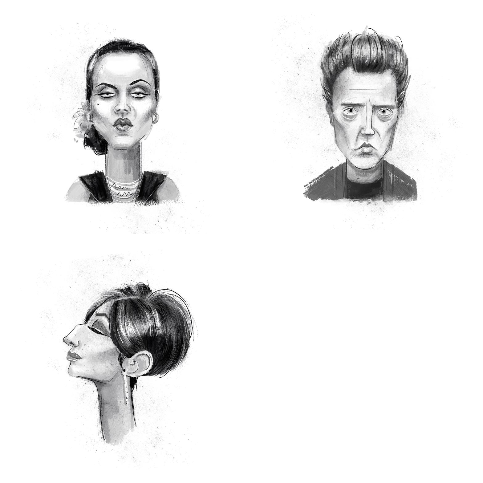
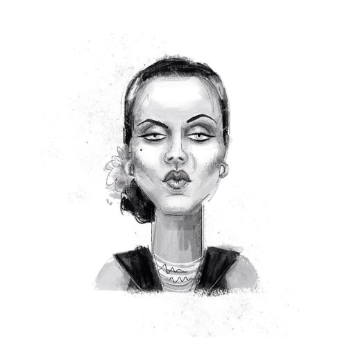
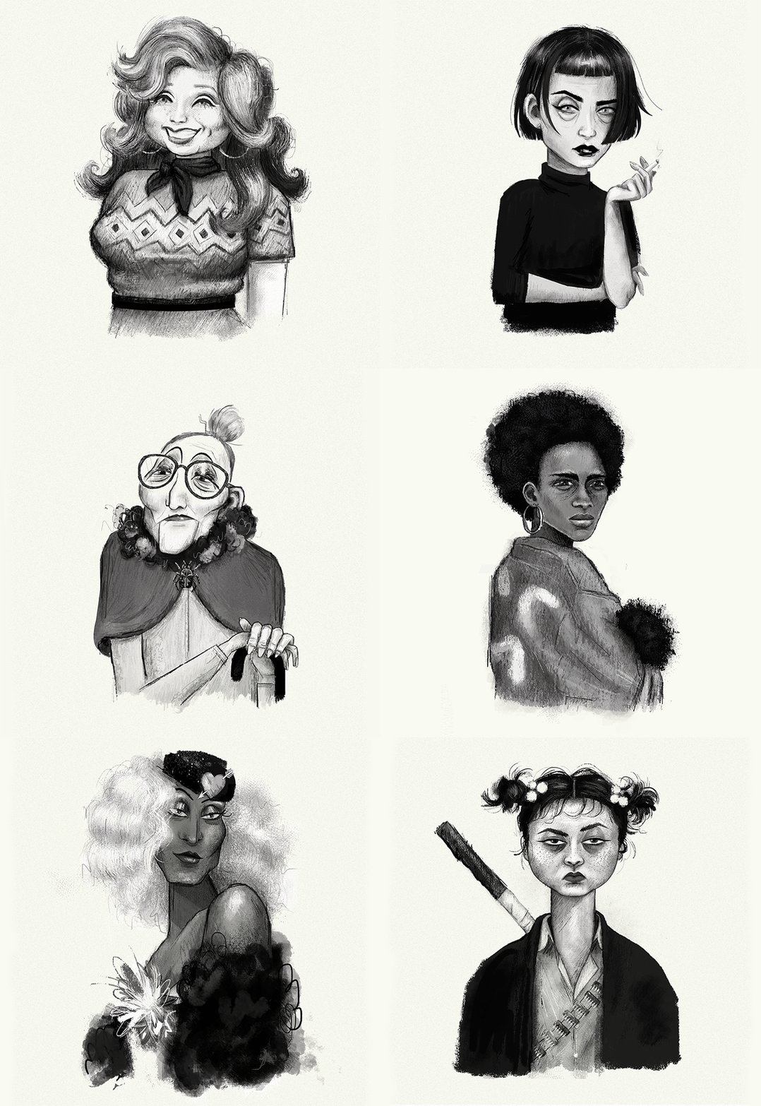
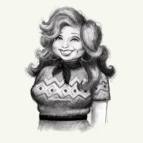
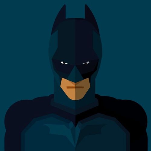
There are two main threads in the Paperface portfolio. The first is based on clean and colourful line work, using strong, graphical forms to make an impact. Abi’s second style reveals her love of texture as she paints in loose brushstrokes, often creating characters in monotone shades and capturing all the nuances of hair and fur, wood grain, wrinkly skin and more…Awards
2019 – World Illustration Awards – SAA Agents Award for New TalentClient list
Abi has a growing client list that includes The Saturday Telegraph, The Wall Street Journal, Tails.com and Ollie’s Honey Company.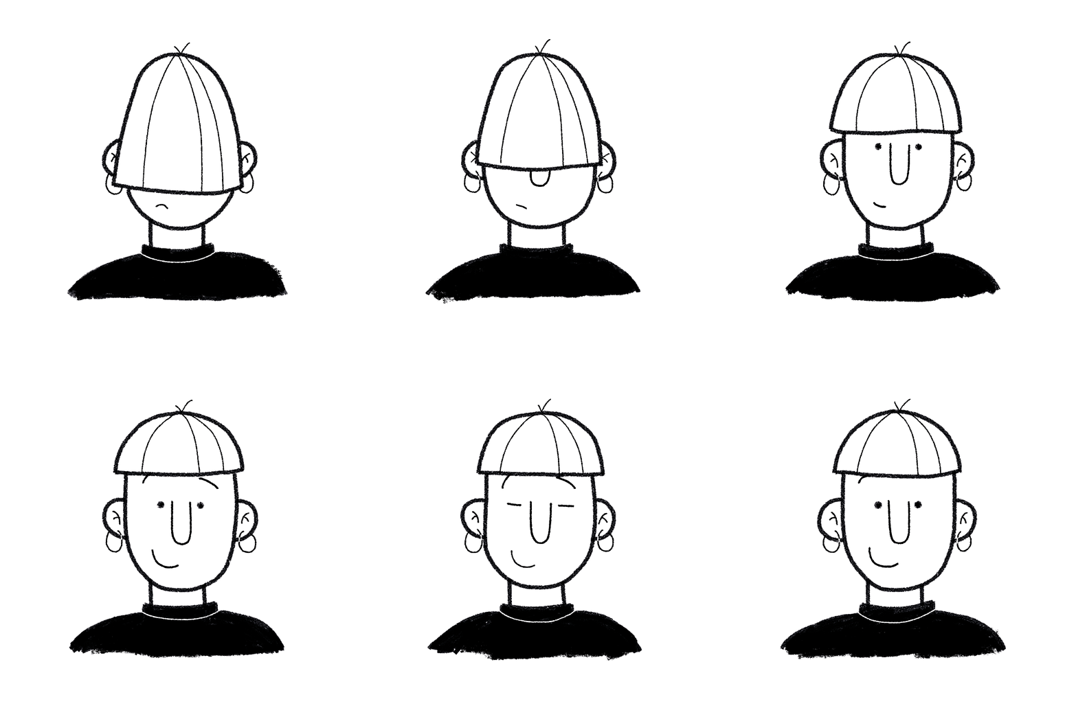









Browse all animators by style
Hello

