Best Money I Ever Spent
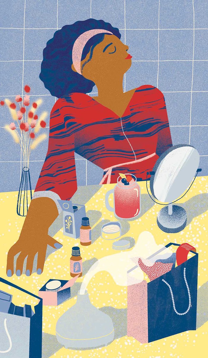
Gina Rosas' illustrations are used for a Real Simple Magazine and Capital One Ad to help explain how to make the most of your money.
The editorial illustrations are punchy, fun and simple, made with Gina's wonderful textured marks in pleasing compostions.
The article explains the many ways to make the most of your money, including tips from Capital One to help the customers on their path to purchasing. The color palette was inspired by the Capital One logo to highlight the brand, and the ideas played with metaphors mainly aimed at a feminine audience.
editorial
stylised
conceptual
finances
lifestyle
contemporary
texture
money
gina rosas
gina rosas moncada
Briefly describe what you are looking for, and Genie will try and suggest some ideas.
ask an agent
Search
Search picks out matching ideas and keywords from our artists, styles galleries and news archive, and invites the AI Search Genie to offer artist suggestions for your project.
Howdy


