INSIDE OUT: Gone with the Gin Cocktail Recipes
How Lauren Mortimer helped fill Tim Federle’s hilarious cocktail book with equally funny illustrations.
Written by Garrick Webster
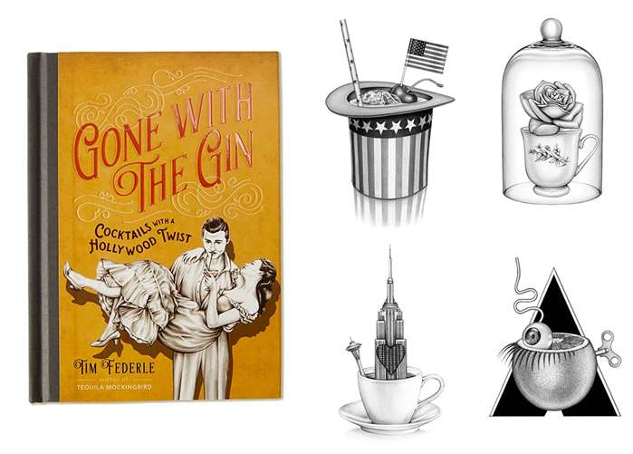
What do you buy for the film buff who has everything? Author Tim Federle and Running Press came up with the perfect purchase last year with Gone with the Gin, a book of pun-tastic cocktail recipes all based on film titles. Along with the titular tipple, you can also mix A Sidecar Named Desire, Whiskey Business, Bonnie and Mudslide, Boozy and the Beast, Blade Rummer and, of course, Ti-Tonic.
The book wouldn’t be half as fun without the clever concepts in Lauren Mortimer’s highly rendered pencil illustrations. Two years earlier she illustrated Tim Federle’s previous book, Tequila Mockingbird, with its literary theme. Running Press decided there was no point in splitting up a winning team.
"When I first found Lauren’s work, I knew she was just the right fit," explains Joshua McDonnell, associate design director at Running Press in Philadelphia. "She did a piece of a boy with a wolf’s head that made me think she would be able to add just the right amount of subtle humor to each piece."
The Brief -
Joshua knew what the palette would be and had an overall direction in mind, but didn’t need to issue a tight brief for the illustration. He gave Lauren what every illustrator dreams of: total creative freedom. Of the 50 recipes in the book, she illustrated 40.
"I received the entire manuscript and picked out the recipes I thought would be fun, and visually interesting," explains Lauren. “There was a lot of research involved, and I initially jotted down key themes for every film in the book before doing any sketches."
One challenge was to make the films instantly recognisable from the drawings, despite the inclusion of the glasses, ice cubes, garnishes and other cocktail essentials in the pictures. Another tricky issue was that so many thrillers feature guns in their key scenes. In order to avoid repetition, Lauren allowed herself just one gun. She used Pinterest a great deal while working, pinning stills from the films, as well as reference images of the other props she needed.
During the sketching phase, she tested her concepts and refined them. "Some were much easier for me than others; some were almost instant ideas, and others I found really challenging, where I'd have to do a few sketches before I came to a solid concept I was happy with. I knew with Ti-Tonic, for instance, I wanted to have the iceberg as a giant ice cube, and the ship as garnish broken in half," says Lauren.
Have Fun With It -
"My art direction was primarily ‘have fun with it’," adds Joshua at Running Press. "She would send me sketches for each one and I would then either approve them so she could begin working on finals, or request a few adjustments or an occasional redo. But most of the time, she nailed it."
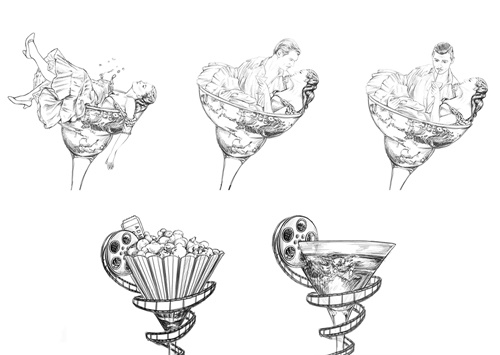
The cover is always the most important page of any publication, and here the process was more intensive. Running Press wanted something that followed on from the previous book, visually, and had plenty of internal discussion about the right tone and image. Lauren worked on half a dozen sketches and Joshua settled on a classic image of Rhett Butler and Scarlet O’Hara… with a twist. There were a few rounds of amends to get the right touch into the final jacket illustration.

above - work in progress sketches for the front cover
When the book came back from the printers in October, Lauren loved it. Joshua, meanwhile, is so happy with it he hopes there will be five more in the series. Flicking through the book, author Tim Federle is taken by one page in particular: "My favorite drawing is the Little Schnapps of Horrors image, which features the Audrey 2 overgrown plant from the movie, except he's tending bar. Only Lauren Mortimer would have thought of that. I'm trying to put together my next book quickly before we can't afford her anymore." (See top left image below).


