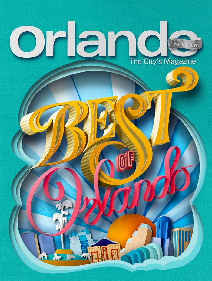
Best of Orlando
Gail Armstrong was recently commissioned to create this vibrant front cover.
Here Gail tells us a bit about approaching the cover with sensitivity and awareness
"It ended up being a far more sensitive piece than anyone could have anticipated. Every year the magazine celebrate the best of Orlando - it’s people, nightclubs, shops, restaurants, entertainment etc. The brief was to be vibrant, lively, celebratory and bursting with activity. However, just as the initial drawings were approved and I’d begun cutting the elements in paper, Orlando was subjected to a week of tragedy - first the shooting of pop singer Christina Grimmie, then the horrific nightclub shootings that left 49 dead, and then the 2-year old killed in a crocodile attack in a hotel resort. Obviously, the cover image now felt frivolous and inappropriate.
With Orlando reeling and very shaken from events, I felt very committed to getting the tone and atmosphere of the cover right. Orlando was pulling together and people were supporting each other and trying to rise above adversity - the cover needed to reflect that spirit. The type became the hero of the image, with the border forming a window onto a representation of the Orlando skyline with the sun rising behind it, symbolic of how Orlando was pulling itself together and literally rising above events."


